Hello from Kiva
Product
Brand
2 mins
read
⁕ Prélude
Medium
Figma, Creative Cloud, TailWind
Role
Project timeframe
2+ years – FTE
Relevant links
N/A
Prélude
Medium
Figma, Creative Cloud, TailWind
Role
Project timeframe
2+ years – FTE
Relevant links
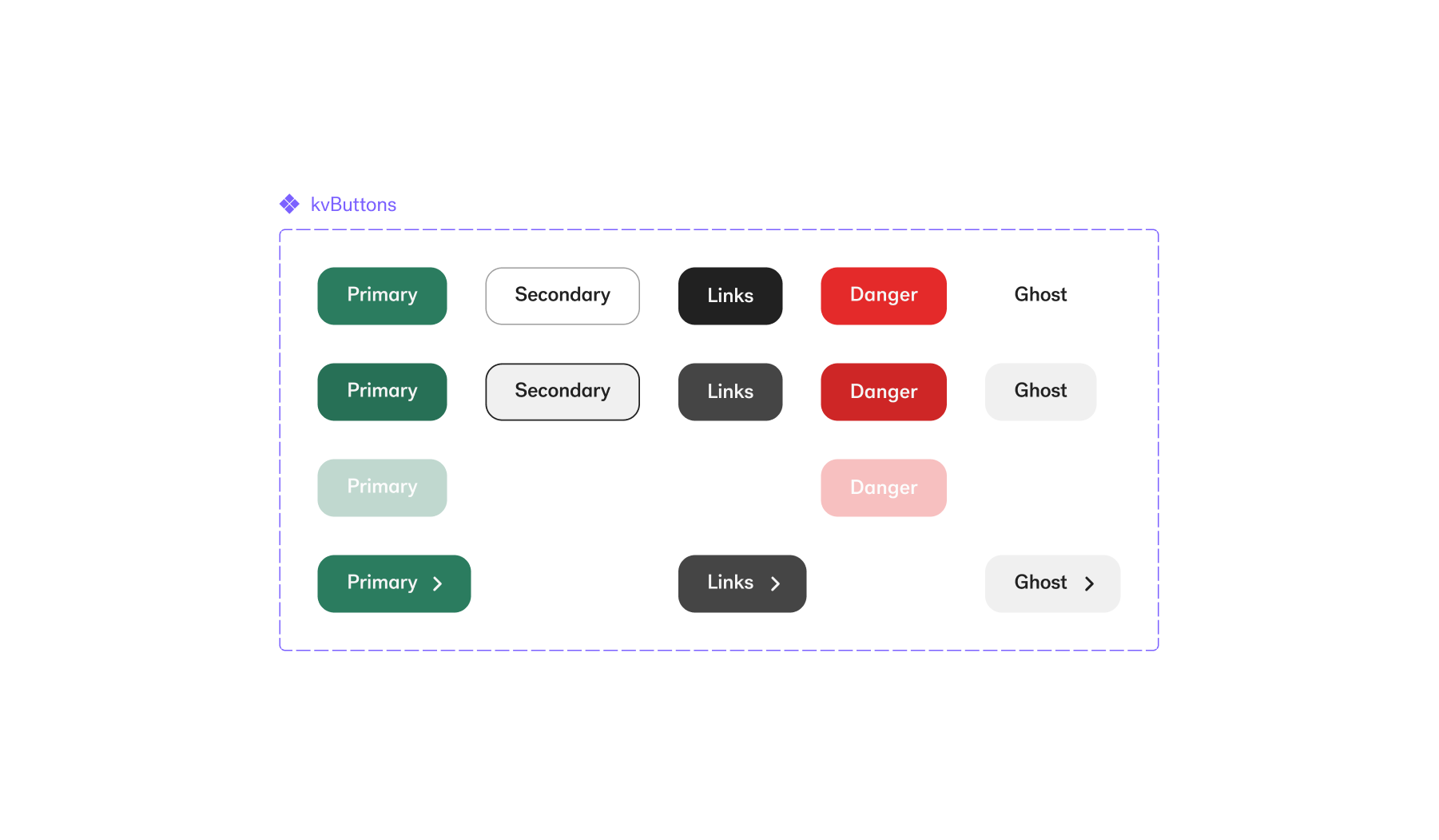
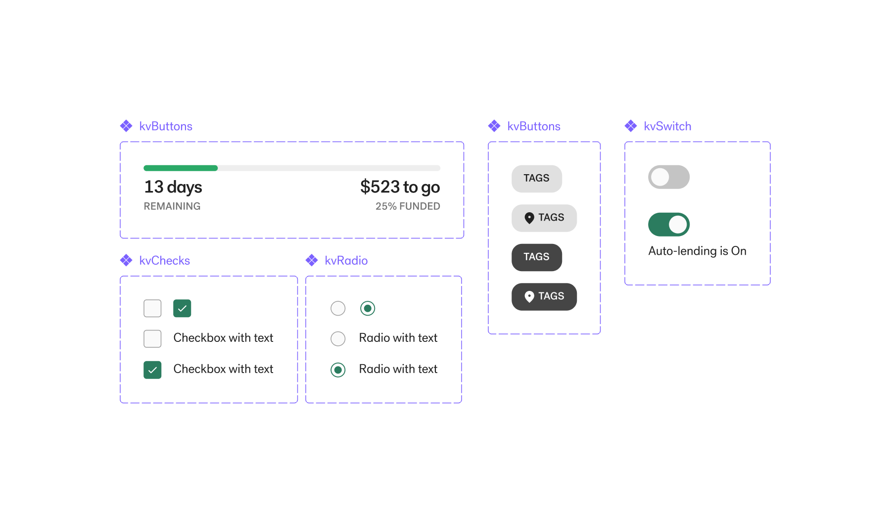
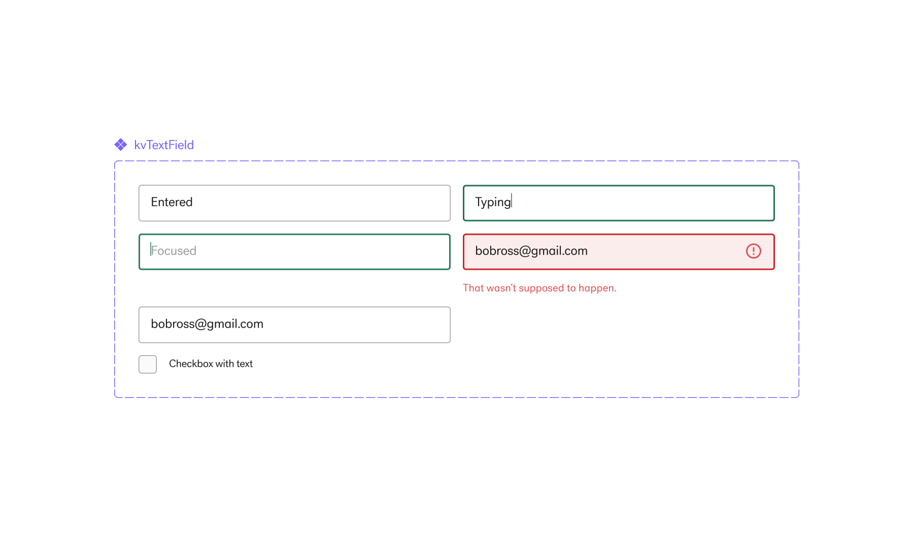
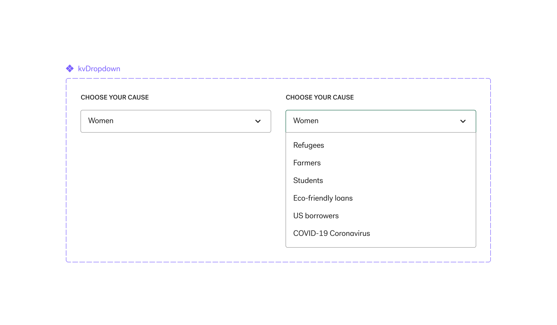
The task of building a design system was set in place to improve upon components that were built prior to Kiva establishing a design team.
Being part of the first team of designers hired and headed by our creative director, Olly Farshi, my role was to build a system that followed Kiva’s brand heritage while improving upon its modernity as well as accessibility. I worked closely with our senior product designer, Nathan Treviño, who co-built and helped bring this work to reality. The final product was then implemented by engineering into Tailwind CSS, where the system was part of a larger, cohesive conversation across all web and mobile products at Kiva. The elements were also added to our Figma team library as variable components.
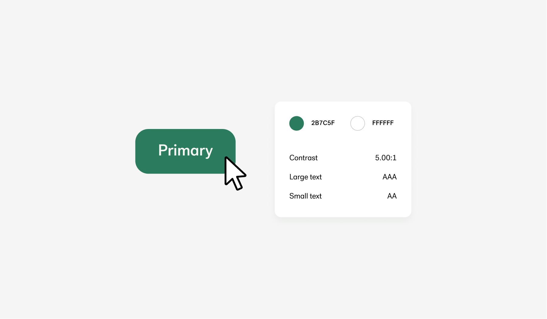
Accessibility first
One of the biggest priorities when building the new design system was accessibility. We wanted to make sure that each element in our system inherently considered all of our users without needing to have a secondary work around. Designing with close attention to WCAG compliances, I was able to build components that were highly accessible while preserving Kiva’s brand and heritage.
Illustrations
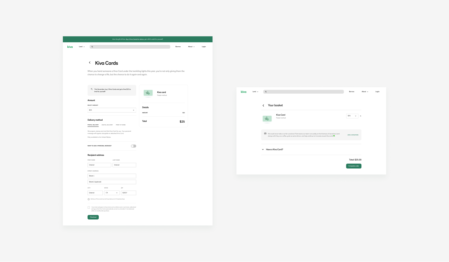
Wanting to better express the emotion of Kiva, I was also tasked in creating illustrations that set a strong footing for future brand identity work. What this also enabled for us was a new way to tell our stories. These illustrations were used across experiences in both marketing and product teams across Kiva such as socials, emails, campaigns, checkout flows, homepages, and more.
![]()
![]()
Icons
As a side project, I also set out to make icons to go along with our illustrative style to be used across all our products.
![]()
![]()
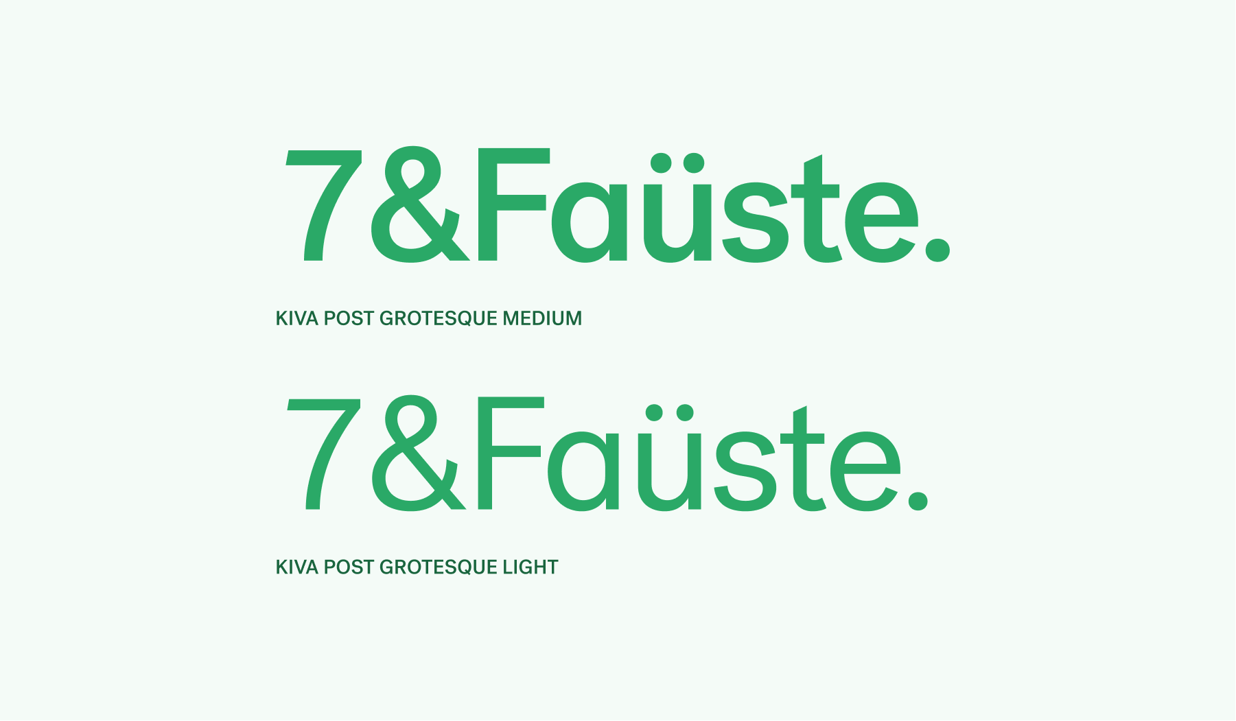
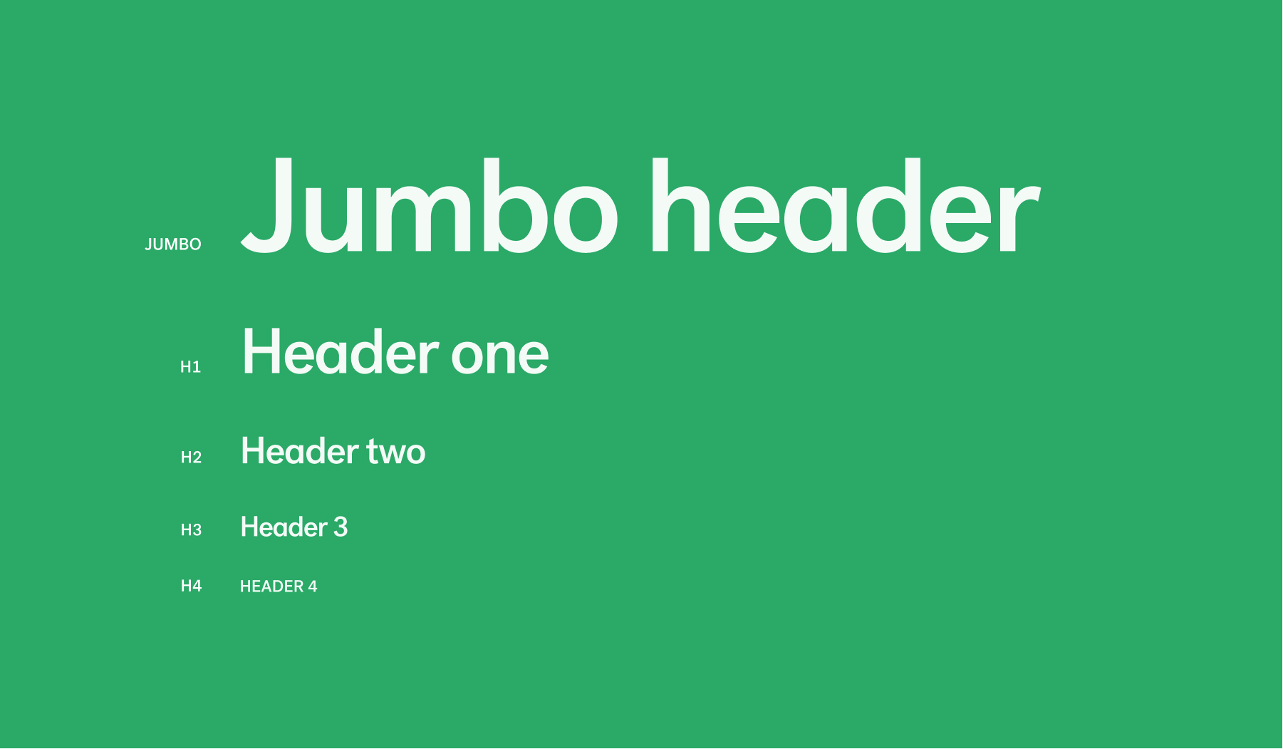
Typography
When first coming into Kiva, our tailored font, Kiva Post Grotesque, was already built and set in place in throughout many of our experiences. Yet, at its previous state, it still had room to grow and also needed a guideline to give each style a home of its own. To improve on its look and feel, I adjusted the letter-spacing and kerning of each character to reflect current sans serif trends. With Nathan Treviño, we developed a cohesive, hierarchical set of headers and paragraph styles following Gestalt principles of design.